
A good graphical abstract is not a decorated version of the written abstract. It is a compact visual argument: what was studied, how it was studied, what changed, and why the result matters. That distinction is important because most weak graphical abstracts do not fail because of color or drawing quality. They fail because they contain too many facts, use the wrong visual structure, or imply a stronger conclusion than the data supports.
This guide presents a practical, step-by-step workflow for turning a paper into a clear visual summary. It also explains how the workflow changes for mechanism studies, clinical comparisons, engineering pipelines, time-dependent research, and review articles. The goal is not merely to make an attractive figure. The goal is to create an accurate, readable figure that can survive journal review, work in a presentation, and still make sense when seen as a small thumbnail.
Begin With One Sentence, Not With Icons
Before opening a design tool, write the paper’s central message in one sentence of no more than 25 words. A useful formula is: “In [system or population], [intervention or method] changes [primary outcome] through [mechanism or key process].” If the study is descriptive, replace “changes” with “is associated with” or “reveals.” This protects against a common scientific communication error: showing causality when the experiment establishes only association.
Next, underline the four indispensable elements in that sentence:
- Starting point: the sample, population, material, dataset, or scientific problem.
- Action: the intervention, exposure, experiment, algorithm, or analytical step.
- Result: the one outcome that carries the main conclusion.
- Meaning: the mechanism, application, or implication supported by the evidence.
Anything that does not help a reader connect those four elements is a candidate for removal. Secondary endpoints, full method names, references, and detailed statistics usually belong in the caption or paper rather than the image. Keep a number only when its magnitude is the message—for example, a 42% reduction, a threefold increase, or a clinically important difference. This “evidence spine” becomes the content brief for the figure.
Step-by-Step Workflow: From Paper to Publishable Visual
Step 1: Capture the Journal Constraints
Journal specifications should shape the canvas before any design work begins. Create a small specification sheet with the required width-to-height ratio, file type, resolution, maximum file size, font rules, and whether a caption is required. Also check if the figure will appear in color online but grayscale in print. A visually perfect square graphic can become unusable if the journal requires a wide landscape panel.
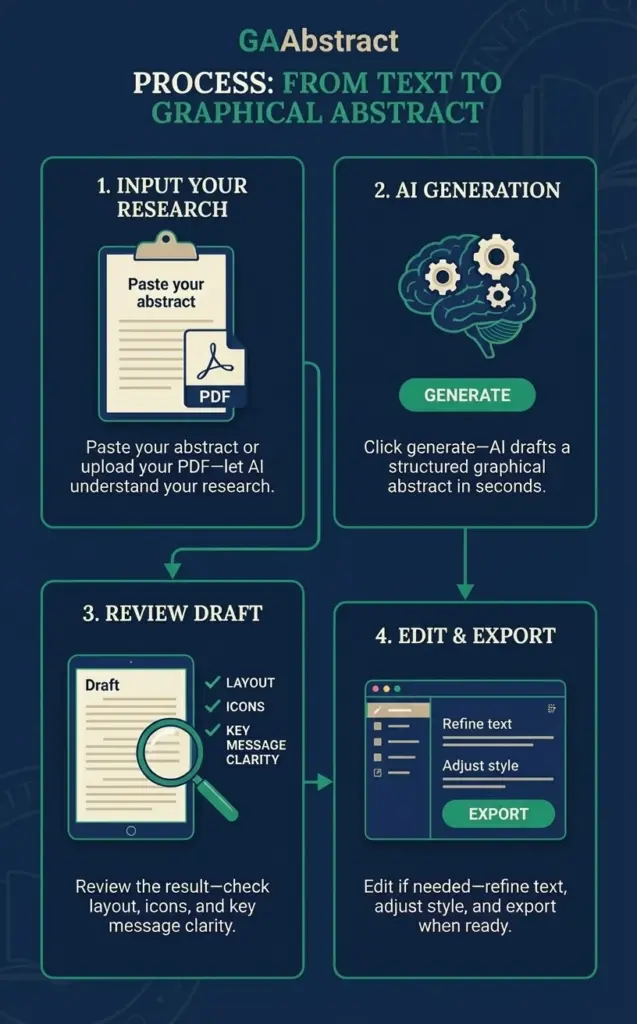
If exact specifications are not yet available, begin with a landscape layout and preserve editable source content. GAAbstract, for example, displays a default 300-DPI, 4-by-2-inch option, but the final export should always be checked against the target journal rather than treated as universal.
Step 2: Convert the Paper Into a Five-Line Brief
Do not paste an entire manuscript into a figure and hope that design will solve the density problem. First create a five-line brief:
- Context: What problem or knowledge gap is being addressed?
- Input: What material, population, or data entered the study?
- Method: What was done that a reader must understand?
- Primary finding: What result directly answers the research question?
- Implication: What can reasonably be concluded?
Limit each line to roughly 8–14 words. Use concrete nouns and active verbs. “Treatment reduced inflammatory signaling” is easier to visualize than “A reduction in inflammation was observed after treatment.” Preserve technical terms that determine scientific accuracy, but remove phrases such as “the results showed that” because the arrow and layout can already express that relationship.
Step 3: Select a Layout Based on Logic
Layout is not a matter of taste; it is a model of the study’s reasoning. A flow layout fits a process with a clear beginning and end. A comparison fits treatment versus control or method A versus method B. Branching shows one input producing several pathways or outcomes. A matrix is useful when two dimensions must be compared. A circular layout represents a repeating cycle. A timeline preserves stages or follow-up points. A radial layout organizes several concepts around one central idea.
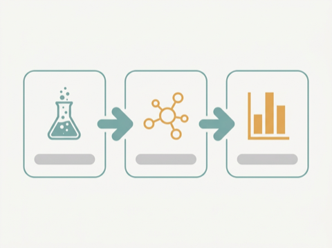
A quick decision rule helps: if the sentence contains “then,” choose flow or timeline; if it contains “versus,” choose comparison or matrix; if it contains “leads to several,” choose branching; if it contains “interacts with,” consider radial; and if it contains “repeats,” choose circular. Readers should understand the direction of travel without having to study every label.
Step 4: Generate a First Draft With Explicit Instructions
An AI first draft is most useful after the evidence spine and layout have been defined. A graphical abstract maker ai can reduce the time spent converting text into an initial composition, but it should receive a structured brief rather than an unfiltered manuscript. In GAAbstract, a researcher can paste an abstract or upload a PDF, select a layout such as flow, comparison, branching, matrix, circular, timeline, or radial, and optionally provide a reference image to guide visual style.
A productive instruction follows this pattern:
Audience: [specialists, multidisciplinary researchers, clinicians, or students]
Structure: [flow/comparison/timeline/etc.]
Include: [the four indispensable elements]
Emphasize: [one primary result]
Exclude: [secondary outcomes, unsupported mechanism, decorative detail]
Visual constraint: [landscape, minimal text, accessible contrast, left-to-right reading]

The first output is a hypothesis about how to communicate the study, not the final scientific record. Its value is speed: it gives the author something concrete to evaluate and revise.
Step 5: Run a Scientific Accuracy Audit
Check the draft against the paper line by line. Every icon, arrow, label, and number makes a claim. Verify entity identity, arrow direction, treatment order, units, group labels, sample type, and whether an increase or decrease is shown correctly. If the study is observational, avoid arrows that visually imply causation. If a mechanism remains hypothetical, label it as proposed or use a dashed connector rather than presenting it as established.
A useful audit is the “claim-evidence map.” For each visual claim, identify the figure, table, or result paragraph that supports it. If no source can be named, delete or qualify the claim. This practice catches an important failure mode of automated generation: a visually plausible connection that is not actually demonstrated by the study.
Step 6: Edit for Hierarchy and Readability
Make the primary finding the strongest visual element. It can be larger, centrally positioned, or highlighted with one accent color. Keep supporting elements quieter. Use one visual grammar consistently: the same shape should represent the same type of object, the same arrow style should represent the same relationship, and color changes should have meaning rather than decoration.
Shorten labels until they can be read at thumbnail size. Prefer “Drug A inhibits X” over “The administration of Drug A results in the inhibition of X.” Avoid putting text over complex illustrations. Use sentence case instead of all capitals, maintain generous empty space, and do not rely on red-versus-green alone to encode groups because that excludes many color-blind readers.
Step 7: Test the Figure Before Export
Run four tests before finalizing the graphic:
- Five-second test: Can a colleague state the main finding after five seconds?
- Thumbnail test: Is the reading order still visible at approximately 25% size?
- Grayscale test: Do groups remain distinguishable without color?
- Reverse-outline test: Can every panel be mapped back to the five-line brief?
Finally, export at the journal’s required dimensions and resolution. Open the exported file rather than trusting the editing preview. Check for cropped text, rasterized labels, broken symbols, unexpected font substitution, and a file size within the submission limit.
How the Workflow Changes by Research Scenario
Scenario 1: Molecular or Cellular Mechanism
Mechanism studies often need to connect a trigger, molecular interaction, pathway, and phenotype. Use a left-to-right flow when the sequence is established, or branching when one regulator affects multiple downstream pathways. Keep biological scale consistent: moving from molecule to cell to organism should be visibly signposted rather than silently mixed.
Start with the stimulus or intervention, show only the pathway nodes required to explain the primary outcome, and end with the measured phenotype. Distinguish direct binding from indirect regulation. Solid arrows can show demonstrated relationships; dashed arrows can show proposed connections if the legend explains the distinction. Do not import an entire pathway map. The graphical abstract should reveal the novel contribution, not reproduce background knowledge.
Scenario 2: Clinical Trial or Treatment Comparison
For a clinical comparison, the clearest structure is usually population → allocation → intervention/control → primary outcome. A comparison or matrix layout helps readers see group symmetry. Include the population characteristic that determines interpretation, the treatment and comparator, follow-up duration when relevant, and the primary endpoint. Secondary endpoints belong only if they change the overall conclusion.
Use identical scales and visual weights for compared groups. A larger treatment icon can unintentionally imply superiority before the data is read. State absolute values when they are more clinically informative than relative percentages, and show uncertainty when space permits. If the design is observational or non-randomized, label it clearly and avoid visual cues that imply random assignment.
Scenario 3: Engineering, Data Science, or Method Pipeline
Method papers benefit from a flow diagram: input → preprocessing → model or device → validation → output. The information gain comes from showing where the new method differs from the standard workflow. Highlight that point, while compressing conventional steps.
For machine-learning research, explicitly separate training, validation, and test data if those distinctions support the credibility of the result. For laboratory pipelines, identify the sample transformation that affects interpretation. Finish with a measured performance or practical output, not merely the name of the proposed model. Using GAAbstract is particularly useful for testing alternative arrangements quickly, but the author must still verify that data do not appear to flow between partitions or stages where no such transfer occurred.
Scenario 4: Longitudinal, Ecological, or Cyclical Research
When time is part of the conclusion, preserve it visually. Use a timeline for baseline, intervention, follow-up, and endpoint, and show unequal intervals accurately when those intervals matter. Use a circular layout only for a genuinely recurring process such as a seasonal cycle or feedback loop. A circle applied to a one-way experiment can falsely suggest that the endpoint restarts the process.
For ecological work, include only geographic or environmental context required to interpret the result. A small map can orient the reader, but it should not compete with the finding. Ensure that colors used for seasons, habitats, or conditions remain distinct in grayscale and are defined in a compact legend.
Scenario 5: Review Article or Conceptual Framework
A review does not have one experiment to visualize, so its structure should expose relationships among concepts. A radial layout works when several themes connect to a central principle; a matrix works when the value lies in comparing categories across two dimensions; branching works for a taxonomy.
Separate established evidence from the authors’ proposed model. One practical method is to use a neutral style for consensus knowledge and one accent style for the new framework. Keep category levels parallel: do not mix a broad domain, a specific molecule, and a clinical outcome as if they were equivalent branches. The figure should provide a navigable map of the review rather than a collage of its keywords.
Conclusion
The fastest route to a strong graphical abstract is not to start designing sooner. It is to make the scientific story smaller and more precise before designing at all. Define one sentence, extract the evidence spine, choose a layout that matches the logic, generate a draft, and then audit every visual claim. GAAbstract can accelerate the transition from paper or abstract to an editable first composition, while the researcher’s judgment remains essential for accuracy, emphasis, and compliance.
When this workflow is adapted to the actual research scenario, the result becomes more than a promotional image. It becomes a compact interface to the paper—one that helps editors, specialists, students, and multidisciplinary readers see the study’s contribution quickly without sacrificing scientific nuance.