For a small contractor, interior designer, landscape company, or building-product seller, “marketing team” often means the owner and a phone. You may be preparing estimates in the morning, checking a jobsite in the afternoon, and posting a completed project to Instagram at night. A custom motion designer is difficult to justify for every campaign, but a static logo pasted onto a video can make otherwise excellent work feel unfinished.
A short logo animation solves a narrow but useful problem. It gives project videos a recognizable ending, makes social clips feel consistent, and adds polish to proposal presentations without forcing the owner to learn a full animation timeline. The goal is not a Hollywood-style reveal. It is a reusable four-to-six-second brand asset that looks credible wherever customers encounter the business.
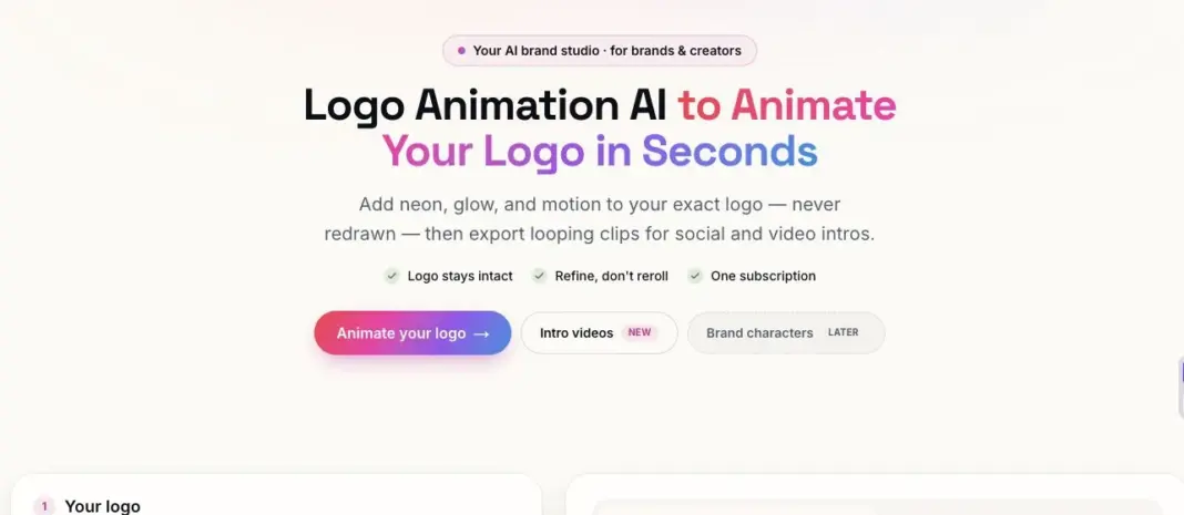
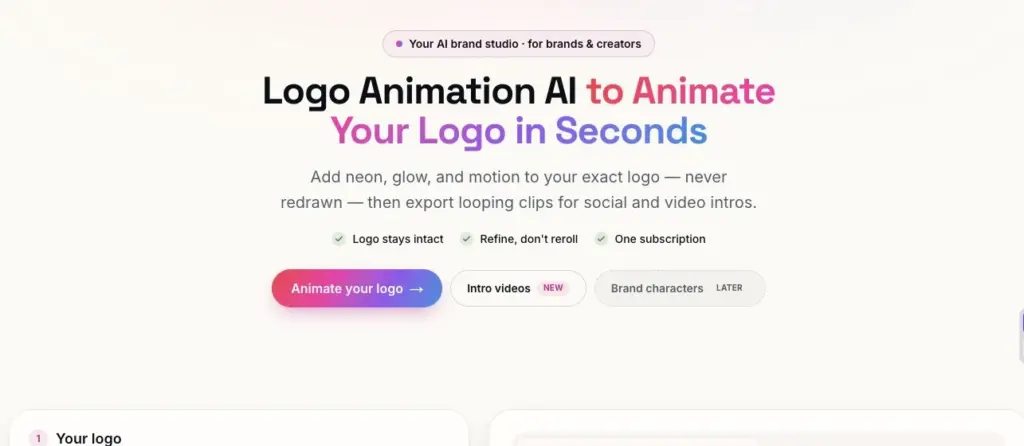
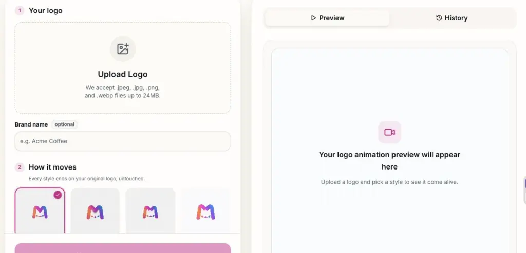
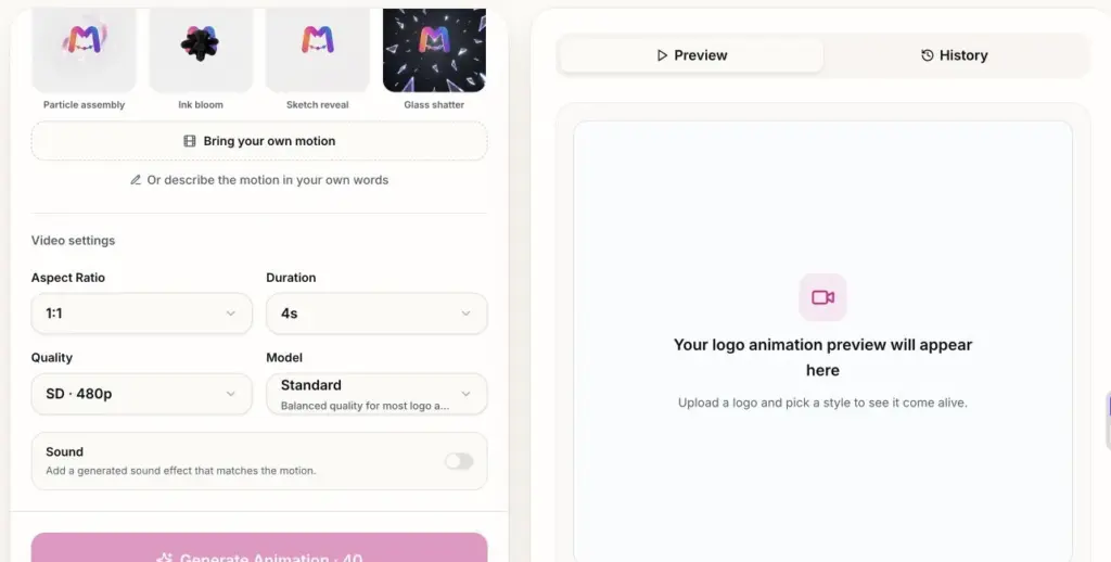
For owners who want to create that asset without keyframing, MorphLogo offers a logo animation ai workspace built around an existing logo file. A user uploads an approved PNG, JPG, or WebP, chooses a motion style or describes the movement in plain language, and sets the aspect ratio, duration, quality, model, and optional sound. The preview and history area supports comparison before export, while MP4, WebM, and GIF options cover common website, social, presentation, and video uses. Crucially, the workflow is designed to finish on the original mark rather than inventing a different company logo.
Where a Logo Animation Earns Its Keep
Small-business marketing works best when one asset can be reused. A logo animation is valuable because the same approved clip can appear in several places:
- At the end of a before-and-after renovation reel.
- On the opening or closing slide of a client proposal.
- As a short bumper in a YouTube project walkthrough.
- On a website hero or portfolio case study.
- In a hiring video showing the team and workplace.
- On a display at a local home show or supplier event.
The return does not come from viewers admiring the animation itself. It comes from repeated recognition. If every finished-project video ends with the same clear movement, color, and final mark, customers begin to connect that visual pattern with the business. Consistency is usually more valuable than novelty.
This is why a small owner should resist the urge to generate a different effect for every post. Build one dependable main animation, then create channel-specific versions of it. Treat it like a logo lockup, brand color, or proposal template: a controlled asset rather than a disposable effect.
Step 1: Choose One Business Job for the Animation
Do not begin by browsing effects. Begin with one task. A local remodeler might want a clean end card for thirty-second project reels. A two-person architecture practice may need an opening for client concept videos. A landscaping company might want a vertical animation for seasonal social posts. A small manufacturer could need a widescreen loop for a dealer display.
Write a one-sentence brief: “We need a four-second closing animation for vertical before-and-after videos, viewed mainly on phones, that makes the company feel precise and dependable.” That sentence answers more useful questions than “Which style looks coolest?” It defines duration, placement, audience, and emotional goal.
Also decide what success means. For a small business, the first success metric is often operational: can the owner or assistant add the clip to every new video in less than a minute? The second is visual: can a customer read the logo clearly on a phone? Only after those requirements are met should the team debate whether the motion is dramatic enough.
Step 2: Prepare the Logo Before Uploading
Use the approved master logo, not a screenshot from a social profile or a compressed image copied from an old invoice. Low-resolution edges, extra background space, and tiny taglines become more obvious when a logo moves. A clean PNG or WebP with transparency is usually the most practical source for a small business.
If the full logo contains a long tagline, prepare two official versions. Use the complete lockup for widescreen presentations and the simpler symbol or wordmark for square and vertical videos. The simplified version is not a redesign; it is a legitimate small-format variation that remains readable when the viewer is holding a phone.
Check the background as well. A dark logo can disappear in a charcoal cinematic scene. Use an approved white or light variation if the brand system provides one. Do not ask the animation model to guess new colors, spelling, or proportions. The source file should already be correct before it enters the workflow.
Step 3: Match the Motion to What the Business Promises
Customers already have an expectation of how different businesses should feel. A structural consultant benefits from controlled lines, stable assembly, and restrained camera movement. A landscape designer may suit a softer reveal or organic bloom. A metal fabricator can use a precise light sweep or material-based motion. An energetic cleaning or home-service brand may support a quicker bounce or pop.
The test is simple: can the owner explain the creative decision in one sentence? “The parts assemble because we coordinate many trades into one finished project” is a defensible idea. “We chose glass shatter because it looked exciting” is risky for a glazing contractor. Motion should make the business easier to understand, not contradict the service.
For most local businesses, restraint travels farther. The animation may appear beside project photography, customer testimonials, safety information, or an estimate. Excessive flashes, debris, fire, or aggressive camera moves can overwhelm those contexts. A clear final logo with one memorable transition is usually enough.
Step 4: Write a Prompt in Plain Business Language
A useful prompt describes what can be seen. Avoid stacking adjectives such as “premium, epic, innovative, powerful.” Instead, specify the starting frame, movement, lighting, camera, and ending.
A prompt for a small renovation company could be: “Fine blueprint lines appear on a deep navy background and align into a simple grid. The logo assembles cleanly from the lines with a restrained warm light sweep. Keep the camera almost still. End on the exact original logo with unchanged colors and proportions, then hold for one second.”
A landscape business could try: “Begin with a soft neutral background. Subtle organic lines grow inward and reveal the logo without covering the text. Use natural morning light and a gentle camera push. Finish on the untouched original mark and hold clearly.”
These prompts work because they separate the effect from the brand rule. The middle can experiment, but the final mark must be readable and accurate. If the logo changes shape or spelling, the render fails regardless of how attractive the movement looks.
Step 5: Pick Settings for the Channel, Not for Prestige
Small businesses do not need the maximum setting for every draft. Start with a lower-quality test to judge direction and pacing. Once the motion is approved, render the final version at the resolution required by the destination.
Use 9:16 for Instagram Reels, TikTok, and YouTube Shorts. Use 1:1 when the business posts mainly to square feeds or wants a flexible social asset. Use 16:9 for websites, proposal videos, YouTube, training material, and event displays. Avoid making one widescreen clip and cropping it into every channel; the logo can become too small or the motion can be cut off.
Four seconds is sufficient for most social endings. Five or six seconds gives a slower architectural reveal room to breathe. Sound is optional. It can help a YouTube introduction, but many social and website placements are muted. The visual should communicate successfully without audio, and a separate silent version is often the most reusable file.
Step 6: Test Three Variations Without Wasting Time
A common mistake is changing every variable at once. The owner selects a different style, rewrites the prompt, changes the camera, and switches aspect ratio. When one result improves, nobody knows why.
Use a small controlled test:
- Keep the same logo, ratio, duration, and prompt. Compare two motion styles.
- Choose the better style. Change only the prompt to reduce or refine the movement.
- Approve the motion, then create the required square, vertical, or widescreen versions.
This approach is especially important when the owner has limited credits or limited review time. It produces a clear decision after a few renders instead of a folder full of unrelated clips.
Use practical filenames from the beginning. riverstone-reveal-v03-vertical-1080p.mp4 is easier to understand six months later than new-final-final.mp4. Save the chosen prompt in a note beside the exports so a staff member can recreate the asset if the service menu or brand colors change.
Step 7: Review Like a Customer on a Phone
Do not approve the animation only on a large desktop monitor. Send the draft to a phone and watch it at normal feed size. Can the business name be read? Does the final logo stay visible long enough? Does the clip work with the sound muted? If the customer has to pause the video to identify the company, the animation is not doing its job.
Pause on the last frame and compare it with the master logo. Check letterforms, spacing, colors, symbol orientation, and any trademark details. Small businesses often build recognition locally through vehicles, uniforms, yard signs, invoices, and social media. A changed mark weakens that consistency.
Also check whether an effect sends the wrong message. A glass contractor should be cautious with shattering. A safety consultant should avoid chaotic flashes. A restoration company may not want an effect that resembles fire or structural failure. Viewers may not analyze the symbolism consciously, but they still feel the mismatch.
Step 8: Build a Tiny Brand-Motion Kit
The final deliverable should be a small kit rather than one large file. A practical starter set includes:
- A 16:9 MP4 for presentations, websites, and YouTube.
- A 9:16 MP4 for Reels and Shorts.
- A 1:1 version if square posts are part of the content plan.
- A silent version for autoplay and muted feeds.
- An AI poster frame or static final logo for slow connections.
- The approved prompt and a simple usage note.
Keep the files in a shared brand folder, not on one employee’s desktop. Add the preferred version to the company’s video template so the owner does not rebuild the ending for every post. The best brand system is the one that a busy team can actually maintain.
For websites, compress the file and avoid forcing a heavy animation to load before the main content. Provide a static fallback and respect reduced-motion preferences. A logo reveal should improve perceived quality without making the page slower or less accessible.
Three Small-Business Scenarios
A Remodeler Publishing Before-and-After Reels
A two-person renovation company records short clips throughout a kitchen project. At completion, the owner edits a vertical before-and-after reel on a phone. A four-second line-assembly logo closes the video, followed by the phone number in the platform caption rather than inside the animation. The same ending is used on every project, helping followers recognize the company before they read the account name.
An Interior Designer Presenting a Concept
A small interior studio sends clients a narrated concept walkthrough. A soft sketch reveal opens the video, matching the transition from drawings to a finished space. The full wordmark is used in 16:9 because the presentation is viewed on a laptop or television. A simpler symbol version is reserved for social clips.
A Local Building-Product Maker Launching a New Item
A small workshop produces custom metal screens and wants to introduce a new pattern. The owner films the cutting and finishing process, then uses a restrained metallic light sweep on the logo at the end. One widescreen export goes into the dealer presentation, while a vertical version is added to the workshop reel. One creative idea supports two sales channels.
A 30-Minute Owner-Led Workflow
When the logo file and business goal are ready, the first working draft does not need to become a large project. Spend five minutes choosing the single use case. Spend five minutes cleaning and selecting the correct logo version. Use ten minutes to compare two styles with the same settings. Spend five minutes refining the clearer option, and five minutes checking the result on a phone.
The owner should stop when the asset is accurate, readable, appropriate, and reusable. More iterations do not automatically create more value. If customers will see the clip mainly at the end of short project videos, a clean four-second result is a better investment than an elaborate sequence that delays the actual work.
Common Mistakes Small Businesses Can Avoid
Starting with an effect instead of a business use: Define the channel and customer first.
Uploading a poor logo file: Find the approved transparent master before spending credits.
Trying to communicate every service: Let the animation express one quality, such as precision, warmth, or energy. Use the caption and landing page for details.
Rendering everything at maximum quality: Test direction cheaply, then invest in the approved output.
Ignoring the final frame: The logo must remain accurate and readable; the effect is secondary.
Creating a new style for every post: Repetition builds recognition. Use one main motion system across projects.
Forgetting performance and accessibility: Compress web files, include a static fallback, and avoid excessive flashing.
Final Takeaway
Small business owners do not need to become motion designers. They need a clear brief, the correct logo file, a motion idea connected to the service, and a disciplined review process. AI reduces the production barrier, but the owner’s judgment still protects the brand.
Choose one useful job, describe visible movement in plain language, test one variable at a time, and approve the result on the device customers actually use. Then save a small set of channel-ready files and reuse them consistently. A short logo animation will not replace strong workmanship, good reviews, or clear project photography. It can, however, give those assets a professional and recognizable finish every time the business publishes.