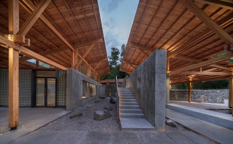
Shulin Architects have designed a “Multifunctional Service Center” that harmoniously blends contemporary architecture with nature. Their foremost priority has been to incorporate sustainable design principles, integrate biophilic elements, and minimize ecological impact. The service center features large windows that frame breathtaking natural views, green roofs, living walls that seamlessly blend with the surroundings, and minimalist aesthetics that reflect the elegance of nature. The holistic approach adopted doesn’t aim to merely coexist with nature but to thrive within its embrace. It presents a vision of sustainable, aesthetically pleasing, and ecologically conscious design.
The project has been led by Shulin Architectural Design, with lead architects Chen Lin and Liu Dongying collaborating alongside construction lead Yang Meng. The multifunctional service center boasts a generous built area of 380 square meters.
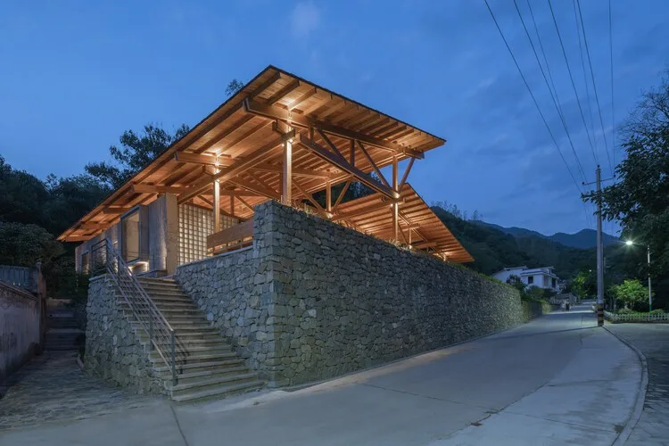
A Bridge Between Architectural Design and the Natural World
Nestled in the breathtaking landscape of Shaanxi Province, China, the Liuba Mountain Scenic Area has been meticulously crafted by Shulin Architects to serve as a gateway to the Qinling Mountains. The recently completed visitor center stands as a bridge connecting contemporary architectural design with the surrounding natural world. It primarily encompasses facilities for reception and consultation, public restrooms, sales of cultural and creative products, and a book bar. This center not only provides a space for villagers to relax but also embodies a strong sense of openness.
Capturing the Site’s Essence
During their initial visit, the Shulin architectural team was greeted by a stunning backdrop of mist-draped mountains. Against the hazy mountains in the distance, two horizontal red brick buildings were strategically positioned at varying elevations, creating a sensation of being enveloped by the surrounding mountains. Looking across the site from an open space, the view was simple yet captivating, revealing distant mountains above the rooftops. This initial visit unveiled two key elements: the architectural axis and the mountain’s visual perspective. The new building aims to preserve the original site’s character by retaining its texture and axis.
The Essence of Architectural Elements
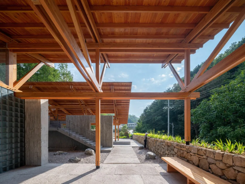
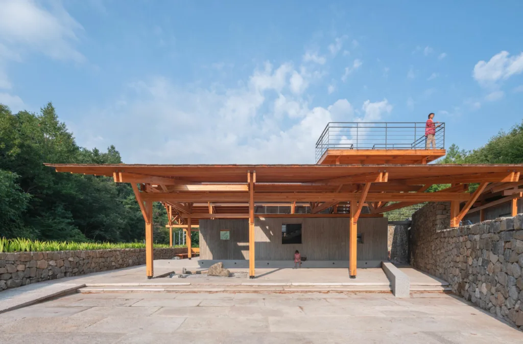
The architectural design thoughtfully divides the fundamental components of the structure: roof, structure, walls, and ground. Below three prominent roofs dedicated to public reception, open public areas, and public restrooms, you’ll find functional spaces. These roofs are supported by prefabricated plywood roof trusses of varying scales, echoing the design logic reminiscent of traditional Chinese wooden structures.
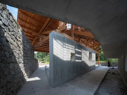
From the project’s inception, the aim was to establish a clear structural logic for the entire architecture, encompassing the platform, walls, wood structure, stairs, and roof. This approach restores the platform’s foundational significance as a site element, clarifies the relationship between the walls and wood structure, and aligns the stairs with the wall. Furthermore, it incorporates walls with three distinct textures aligned with the roof’s orientation. The horizontally laid cast-in-place bamboo formwork concrete wall aligns with the long side of the roof, while the short side features translucent glass brick walls set back behind the concrete wall. All square openings and windows seamlessly integrate into the cast-in-place bamboo formwork wall. Small square window panes retract with open leaves, while larger square windows protrude, with fixed glass installed externally. Crafted from translucent Changhong glass, the doors open onto the glass brick wall. An angled masonry rubble wall connects the three roofs and extends into the reception area, creating an intriguing interplay of elements.
Layout Of The Building
A space along the mountainside axis is designated for restrooms, while a distinct wall separates functional and spatial areas. A climbing path traverses the building along this wall for visitor convenience. On the opposite axis, a reception area with semi-outdoor public space is integrated into the stone wall. Within the building, multiple pathways exist—some ascend directly along the left side of the building without navigating internal corridors, while others enter the building and branch into various paths leading to the mountain. The mountain’s view is elegantly framed by a slanted roof, featuring a rooftop platform for panoramic mountain vistas.
Connection Between Wood Structure and Walls
Three distinct internal and external connections exist between the wood structure columns and the walls. In the reception area, the columns are positioned on the inside, 400 units away from the wall axis, with the wall separated from the structure. Conversely, in the public restroom area, wood structure columns are exposed outside the wall, while in the open public space, the wood structure aligns with the wall axis. These various connections infuse the space with a sense of playfulness and explore the foundational elements of the building and the organizational dynamics between structure and wall.
Multiple Pathways With Varying Elevations
The building’s multiple pathways create a unique walking experience, with varying elevations forming natural slopes and stairs. To provide an enhanced view of the distant mountains, a pathway to the rooftop was designed, weaving between the three roofs along the wall. This veranda ascends and descends, passes through an open roof entrance, and extends to an overhead platform. While intentionally controlled and guided, it also offers numerous choices to eliminate any sense of time during wandering. Aimless wandering allows for numerous alternative routes, with changes in elevation, combining utility and leisure to convey a sense of timelessness.
A Material Palette of Timber and Stone and its Adoption For The Project
A material palette is a thoughtfully curated selection of materials used in design and construction to create a unified and harmonious aesthetic for a space or project. This palette encompasses various elements, such as flooring, wall coverings, finishes, and furnishings, chosen to work together in terms of color, texture, and style. The goal is to ensure that these materials complement each other and contribute to the desired look and ambiance of the environment.
Combining Timber and Stone in a Material Palette
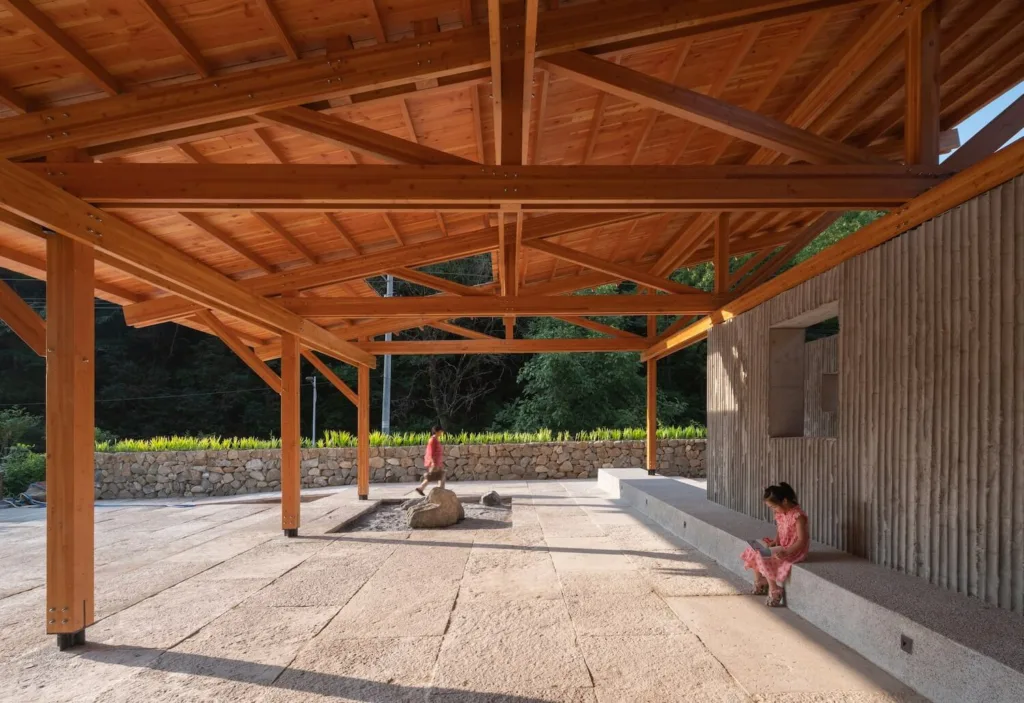
The combination of timber (wood) and stone in a material palette is a design approach that artfully blends the warmth and organic qualities of wood with the solidity and texture of stone. This combination can result in a visually captivating and well-balanced environment suitable for various applications, both indoors and outdoors.
Advantages of Timber and Stone Palette
1. Visual Contrast: Timber and stone offer a striking visual contrast. Timber introduces warm, natural tones and a sense of softness, while stone provides a sturdy and often cool or neutral backdrop. This contrast can be strategically used to draw attention to specific architectural elements or create focal points within a space.
2. Texture and Sensory Experience: Timber brings tactile warmth through its grain patterns and textures, inviting touch and adding a cozy, inviting ambiance. Stone offers various textures, from smooth and polished to rugged and textured, providing opportunities to create diverse sensory experiences in different areas of a project.
3. Aesthetic Balance: The combination of timber and stone can strike a balance between rustic and refined aesthetics. For example, timber beams and stone walls can create a rustic, cabin-like atmosphere, while sleek, polished stone and minimalist timber accents can evoke a more contemporary, luxurious feel.
4. Functionality: Practicality is crucial when considering these materials. Timber is versatile and suitable for flooring, cabinetry, and furniture. Stone is durable and ideal for high-traffic areas like countertops and wall cladding, as well as for outdoor applications.
5. Architectural Features: Timber and stone can be integrated into architectural features such as fireplaces, staircases, and entryways, making them visually captivating and functional elements of the design.
6. Colour Harmony: Attention to colour coordination between timber and stone is essential. Lighter timber shades may complement light-coloured stone, while darker wood tones can contrast beautifully with lighter or grey stone surfaces.
7. Transitions and Blending: Achieving smooth transitions between timber and stone can be done through architectural details like thresholds, moldings, or transition strips. These elements help blend the materials seamlessly where they meet.
8. Lighting Design: Proper lighting can enhance the beauty of both materials. Consider how lighting fixtures can accentuate the texture and colours of timber and stone surfaces, creating dynamic visual effects.
A material palette of timber and stone combines the unique qualities of these natural materials to create a balanced, visually engaging, and functional space. The same concept is adopted for the project.
The architectural materials achieve a delicate balance between warm-colored wood and cool grey cement and stone. Warm tones dominate the upper portions of the building, while grey prevails in the lower sections. Small-sized Douglas fir plywood serves as the primary material, imbuing the structure with its inviting warmth. Additionally, Douglas fir watch boards and red cedar shingles contribute to the warm-toned roof system.
The walls and ground surfaces follow a consistent grey palette, featuring elements like bamboo formwork cast-in-place concrete walls, washed stone steps, aged slate outdoor paving, and terrazzo indoor flooring—all harmonized in subtle shades of grey. Adding a touch of cool contrast, a hint of cold grey seamlessly merges with the glass brick wall, striking a balance with the overall warmth of the color scheme and introducing nuanced variations in materials and textures.
Further enhancing the building’s character and temperature, grey iron railings grace the window bookcases. This design concept seeks to showcase a striking interplay between refinement and ruggedness, harmoniously fusing warm and cool tones, and skillfully uniting lightness and solidity. The result is a fundamental material perception that defines the essence of the building.
Spatial Design
Architecture profoundly influences individuals through its spatial arrangement, interplay of light and shadow, material selection, and experiential aspects. Material collisions manifest not only through colour, light, and shadow but also through texture and tactile sensations. Balancing finesse and ruggedness is a delicate matter, as an excess of detail can overwhelm, while a lack thereof can result in monotony. The proportion and control of relationships, as well as the architect’s intuition, play pivotal roles. Each decision made on-site profoundly impacts the building’s overall quality upon completion.
Fun and Surprises
The concept of fun permeates the design. As people move through space, their bodies and vision undergo continuous changes, yielding constant surprises. The interwoven walls and roofs create informal relations, generating visual disorientation. The spaces between the two walls present varying perspectives. At certain angles, windows overlap diagonally, stacking layer upon layer, providing richer and more focused views. These perspectives offer moments of unexpected delight.
Conclusion
Multifunctional Service Center exemplifies the evolving ethos of contemporary architecture, where the built environment doesn’t just coexist with nature but thrives within its embrace. The architecture marvel stands as a testament to sustainable, aesthetically pleasing, and ecologically conscious design. It serves as an inspiration for future architectural endeavors, highlighting the limitless possibilities when architecture and nature converge in harmony.
Reference: archdaily.com, designboom.com, Zhao Yilong, Wu Ang

