Three-dimensional renderings empower architects and designers to articulate ideas and present projects with unparalleled realism. Creating them requires a combination of various techniques and skills, however.
So, let’s explore six essential tips that can significantly enhance the visual appeal of your 3D renderings and captivate your audience.
Use some sort of visual reference
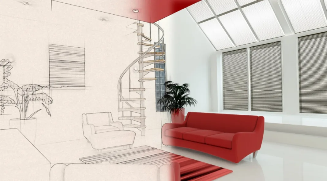
Visual reference serves as a measuring stick you will use to keep your efforts on track. At least if you want your final product to align with your original idea. So, try to sketch your ideas and use them as a way to keep your focus on the most valuable parts of the project. Display family photos with wall art presents an extraordinary opportunity to personalize your living space.
If you are not able to make sketches of sufficient quality, you can check the basics of interior photography and gather the vistas and visual resources you need from the existing properties. Also, be sure to stay up to speed with the ongoing architecture trends and their visual resources. But, be sure to have a visual reference.
Pay attention to lighting
Lighting can dramatically affect how some environments look. As a matter of fact, you will not find any situation where some space is not exposed to some sort of lighting. That is why the lighting, or the way you implement it into your rendering, can be one of the distinguishing factors between failure and success.
Lighting applications like Vray and Corona can make your life a lot easier in this regard. But, as a baseline, you need to understand how to implement lighting, make the renders more realistic with shadows, and leverage contrast. At least, if you want to make your work realistic.
Leverage different textures and materials
This is one of the basics of good 3D rendering – in order to make your work realistic, you need to refine the way you use textures and different materials, as well as account for how they should look during the different parts of the day. A good modeling platform like the Rhinoceros modeling software will make most of these problems go away.
But, you still need to be aware of different textures, their ‘dullness’ and ‘shine’ and other nuances. Don’t be afraid to experiment with different resources that are outside your medium. The effective combination of 2D and 3D resources can be quite effective.
Bring the renders outside
Exterior renderings are just as vital for the final look of your work as the interior models. Well, in order to create realistic architectural designs, feel free to take as much inspiration from real life as possible. That includes all sorts of different visual elements ranging from sky and realistic ground to individual assets like trees and shrubbery.
If you want to you can enrich the renderings with details like water, and reflective glass other details you can encounter in real life. But, use all these elements sparingly. While moderate use can enrich some models, over-reliance will produce opposite effects.
Don’t pursue uncompromised photorealism
You will only waste your time and valuable resources doing so. If you take a look at some of the most famous photos in the world like V-J Day in Times Square by Eisenstaedt, Lunch atop a Skyscraper, or Che Guevara by Korda you will see they are very dramatic and iconic looking but don’t necessarily represent their subject matter in the 100% realistic fashion.
That should be your goal as well. While you should always aim for an adequate level of accuracy, you should also think about staging and the way to sell the environment you present. That’s the same thing real estate agents do in real life.
Make your renderings slightly imperfect
If you are going to use the staging and lighting techniques to push your renderings into the realm of heightened reality, making the environments slightly imperfect will ground them in a very tangible reality and make them easier to consume.
These small imperfections can be something in the vein of a blanket hanging from the edge of a bed, misplaced cushions, toys scattered around the apartment, or even a picture hanging at a crooked angle. Most people will not even be able to pick up these small quirks, but their sub-consciousness will. And that will make your work all the more effective.
We hope these couple of tips gave you a general idea about the approaches you can take to make your future 3D architecture more realistic, appealing, or simply more enjoyable to look at. Visual elements are not always the easiest to work with since quality doesn’t always translate to the most effective product.
The small nuances we have presented above, however, should infuse your work with that special something and push you to the next level. So, feel free to use them at your own discretion.
Authored by Mike Johnston
Images- Image by kjpargeter on Freepik, Image by senivpetro on Freepik, Image by vecstock on Freepik, Image by DCStudio on Freepik,


